commercial project
Orfium Brand Guidelines
Redesign & Expansion
Introducing Orfium
Orfium is the global technology company solving the entertainment industry’s biggest challenges around digital music & broadcast rights management, cue sheets, data and reporting.
The Challenge
2024 marked the need for an Orfium Brand Manual redesign and expansion. The goal was to update and unify existing brand documentation across all marketing and communication assets, ensuring a consistent and impactful representation of the brand.
The Approach
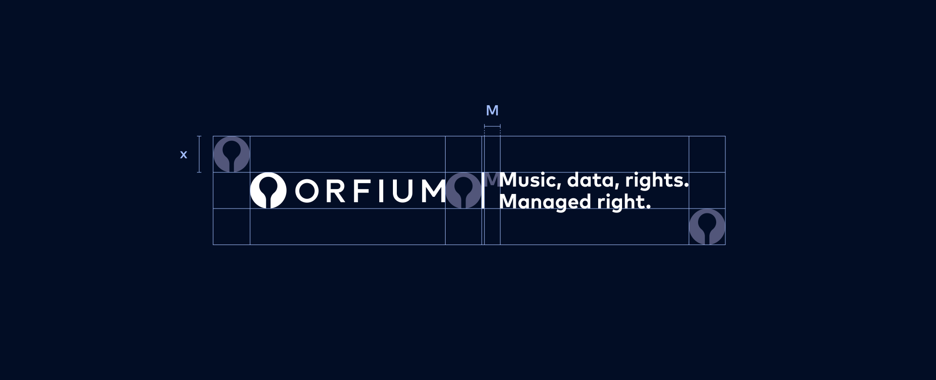
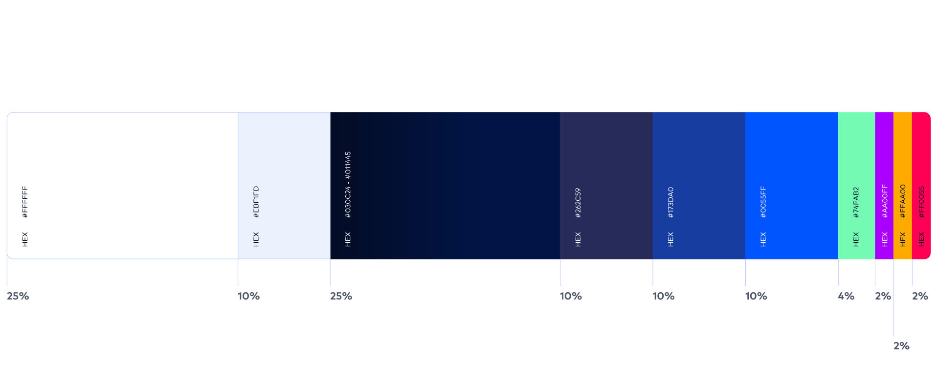
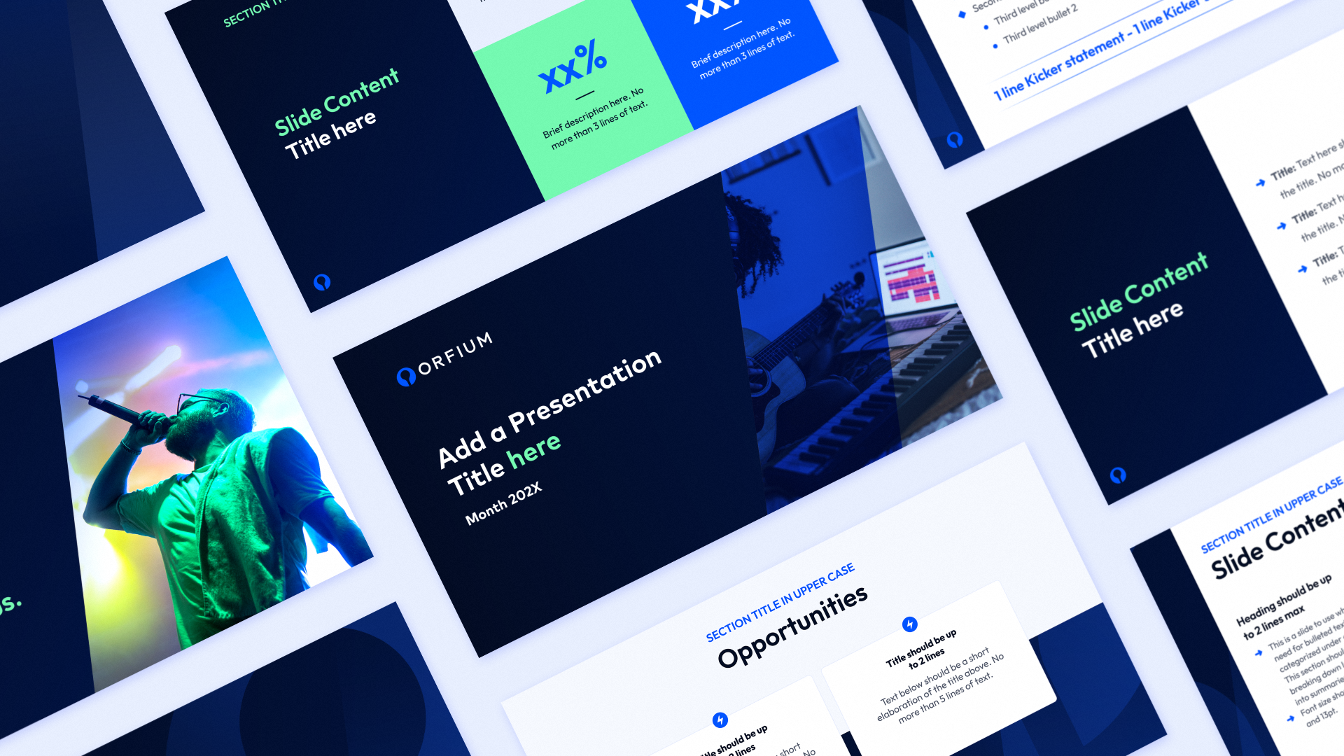
Key areas of the brand system included Brand Elements, Digital Applications, Print Applications, and Life at Orfium—the employer branding initiative. Existing guidelines were reviewed, refined, and, where necessary, adjusted for clarity and consistency. Detailed do’s and don’ts were developed, and graphic, image, and icon libraries were completed and standardized. The illustrated iconography was revisited to ensure consistency across elements—aligning padding, line thickness, corner radius, and angles.

Life at Orfium
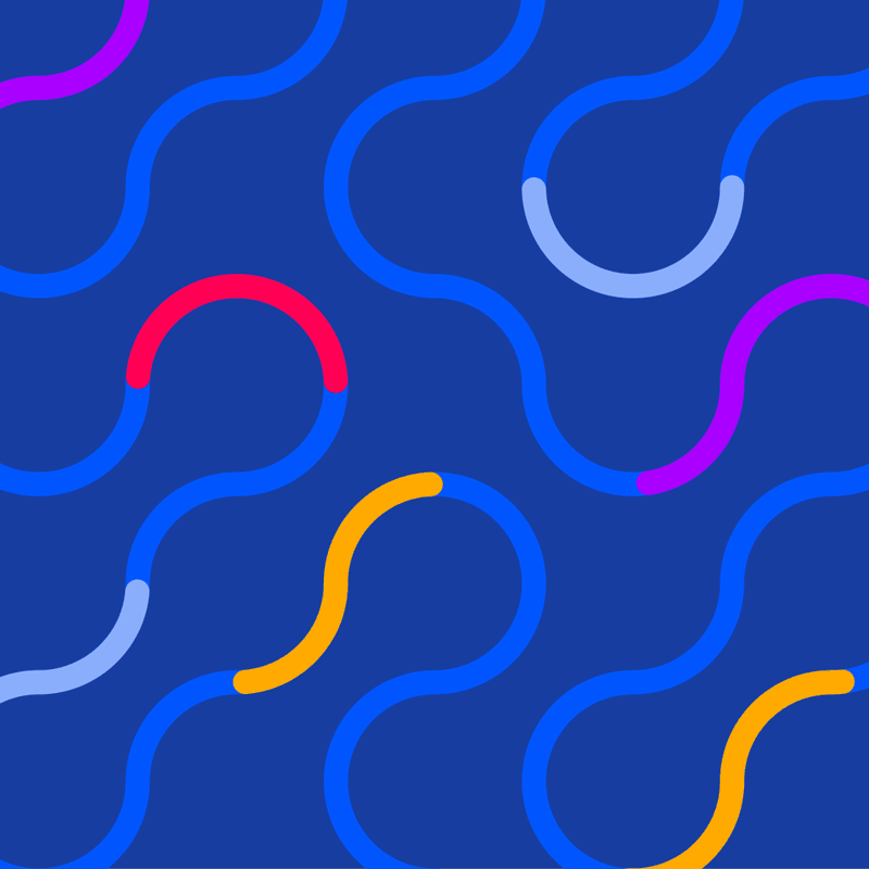
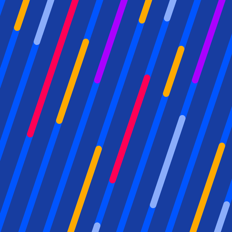
Life at Orfium was further defined as an initiative focused on showcasing company culture and team dynamics. Its visual identity, tone, and usage guidelines were established to distinguish it from the core corporate brand while maintaining visual harmony. Playful and uplifting, the look & feel uses vibrant colors to highlight details within the blue and navy theme.

Credits
Company: Orfium
VP of Marketing: Irene Coghlan
Marketing Manager: Eleni Magoula
Content Marketing Manager: Melanie Schmeelke
Head of Design: Jim Zoitas
Brand Designer & Project Lead: Yvoni Mouchtaropoulou
Website Redesign & Art Direction Refresh: Katerina Miliaraki (Design System Lead), Jen Anastasopoulou (Design Product Lead), Madlen Angelopoulos (Senior Product Designer), Nancy Stathopoulou (Senior Product Designer), Elisavet Xydaki (Product Designer)
Case Study Design & Animation: Yvoni Mouchtaropoulou
Case Study Sound Design: Giuliano Anzani
Bored & Grazed Animation

Orfium Brand Guidelines

BA Thesis Ad Campaign
The Treachery of Cels

Clicktotherapy SM Campaign
Nestlé Supersize Teddy Illustrations